Blogs Grid
Component #1


Component #2
Component #3
Featured
Announcing Front Tutorials: Master Adobe Ai - Part II
A new tutorial to make it easier to master Adobe Ai.
July 15
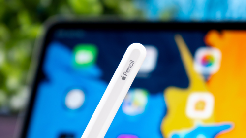
Should You Buy An Apple Pencil?
The Apple Pencil is an expensive device that comes with some interesting features, but not everyone needs them.
July 15